…according to us.

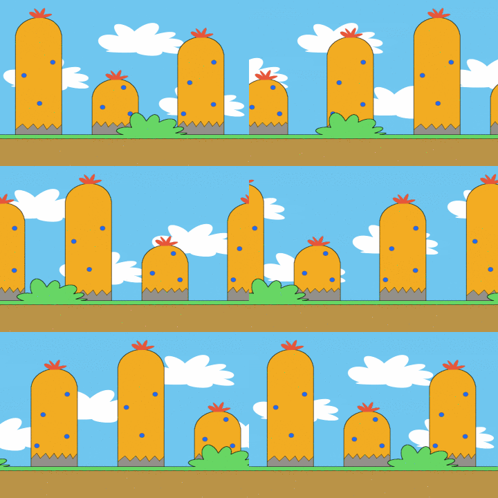
“Parallax scrolling example scene” by OhSqueezy
What the heck is Parallax?! In our words, it is a popular web design technique used for adding depth, unique transitions and some interactive motion to your website’s images and surrounding content. It gives a website a dimensional feel, creating layers of images and information, enhancing the overall user experience.
A little more technical explanation paraphrased from Wikipedia goes like this…
Parallax scrolling is a special scrolling technique in computer graphics, where background images move by the camera slower than foreground images. This creates an illusion of depth in a 2D website, video game or digital presentation – adding to the sense of immersion. This scrolling animation is a very simple example. As the viewpoint moves side to side, the objects in the distance appear to move slower than the objects closer to the camera.
We use parallax in our websites (including this one – can you find it?) quite often, not too much, just enough for effect…. and because we like it so much we’ve scoured the web and compiled a list of the top 10 parallax websites we think use parallax scrolling quite well! Enjoy.
1. Flat vs. Realism
A very complex interactive website by inTacto using more than just Parallax Scrolling – see: skeuomorphism for another day. It’s pretty awesome.
2. 901 Tequila
We love this one. Big, bold, happy people photography… a lot of fun to scroll through. JT’s in there as well so you know it’s cool.
3. Nintendo Game Boy
A bit “salesy” but we dig the retro Tetris.
4. Von Dutch
We need more tattoos and long beards (Kelly’s ok without) after looking through this one. Very cool brand, interesting graphics – perhaps an improvement on page loading time could be made, otherwise a win in our book!
5. Bagigia
Just awesome, minimalist design with lots of whitespace and oodles of interactivity. Inspiring. We’ll work on adding some more movement to this website over time… with all of our time…
6. Spotify
Big fan. Listening to Spotify right now. Day in and out. Fitting they have an incredibly casual and fun filled website too? In this case the photography does all of the work and the technology (and technique) takes a back seat. This is the ideal balance of great design and implementation in my book.
7. Oakley
Loading, loading, loading… These big, long websites require much more bandwidth than what Fairpoint can offer here on Commercial Street, however it’s pretty worth the staying power.
8. Rimmel London
A little too much in your face, glitz and glam, but as far as “fashion” websites go, it’s well done with product isolation in the foreground and big bold photography in the back.
9. Ala
Holy eye-candy! Pixel illustration, white rabbits, and slight motion sickness while moving through. Really great stuff.
10. Putzengel
I don’t understand it but I love it. Cutouts, 2D to the max, it’s all good.


 The Bubbler is a place we put all of the project bragging, inspirational, technical and sometimes witty moments which bubble to the surface while working in the design world and playing around our fine coastal city, Portland, Maine.